Logo design, identity system, and application mockups.
Brand identity
HydroEden
A logo design and identity system for a controlled-environment produce supplier.
01
The brief
A B2B produce brand that had to earn trust before it earned attention.
HydroEden supplies fresh produce to restaurants and hospitality buyers. The identity needed to feel operational and dependable — not agricultural, not premium-lifestyle. Build a mark that a procurement buyer would take seriously on first contact.
Avoid generic leaf-and-nature language. Signal operational control and reliability. Provenance is irrelevant to a procurement buyer.
A mark that holds at crate scale, on vehicles, and in print — without needing colour to stay legible.
Design direction
Precision is the tone of the identity.
02
Logo exploration
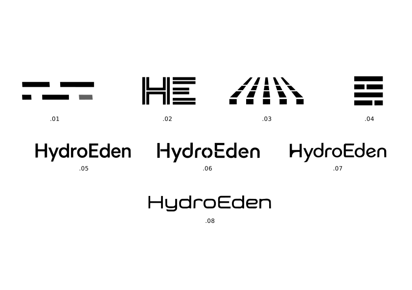
Several directions tested. One kept.
The early work tested organic, modular, and typographic routes. Most were rejected for the same reason: they read as food brands, not supply brands. The final direction came from removing everything that felt decorative.
Search
Early routes leaned organic and agricultural. Both were wrong for a B2B buyer who values reliability over provenance.
Decision
The chosen direction reads as professional in procurement contexts. It does not try to charm.
Constraint
The mark had to hold at crate scale, label scale, and on screen — without colour to back it up.
03
Identity system
Compact and structured. Built to repeat.
System rules
- The mark goes where the brand needs to show up: crates, documents, labels, dispatch surfaces.
- Information stays structured first; the brand never competes with batch, route, or handling data.
- The palette separates control, supply, stock, and signal without becoming decorative.
Colour system
ControlSupplyStockSignal
Type behaviour
Fresh supplywithout softness.
Applications
The mark tested across every surface it would realistically touch.
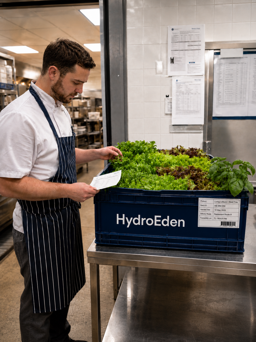
Mockups are not decoration. Each application tests whether the identity holds in real conditions — at a distance, on vehicles, in print, on screen.
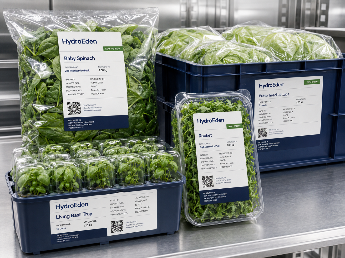
01 / Product labels
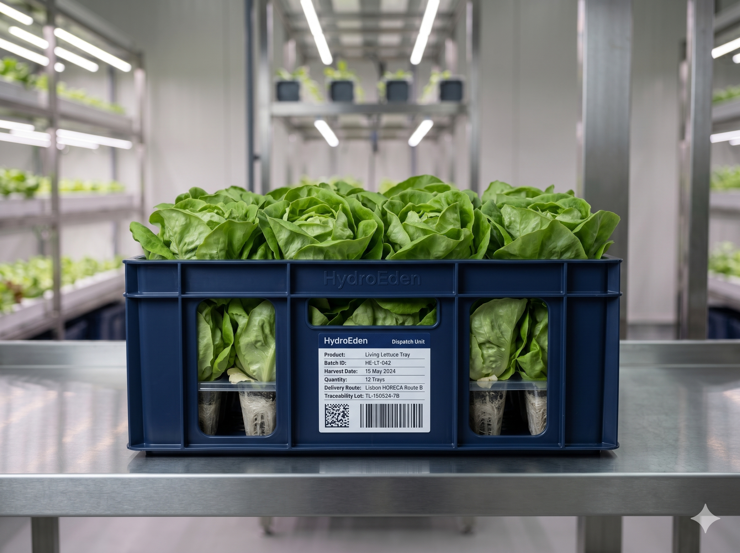
Information becomes identity.
The label carries product name, batch, and handling information. The brand stays visible without competing with the content it is organising.
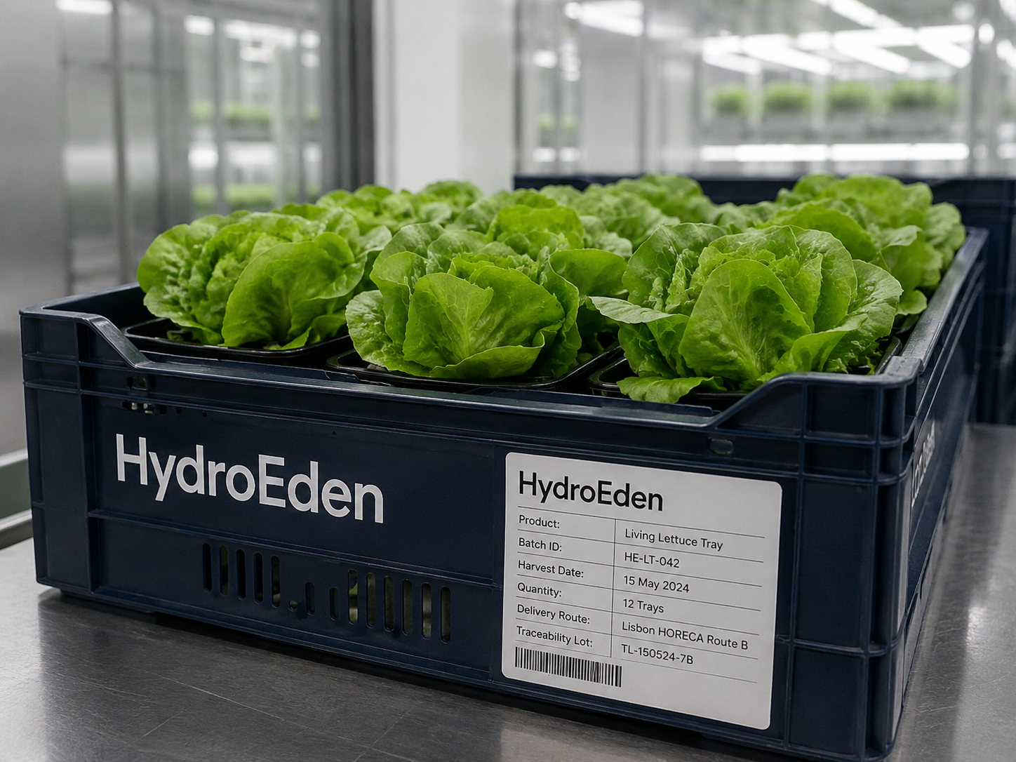
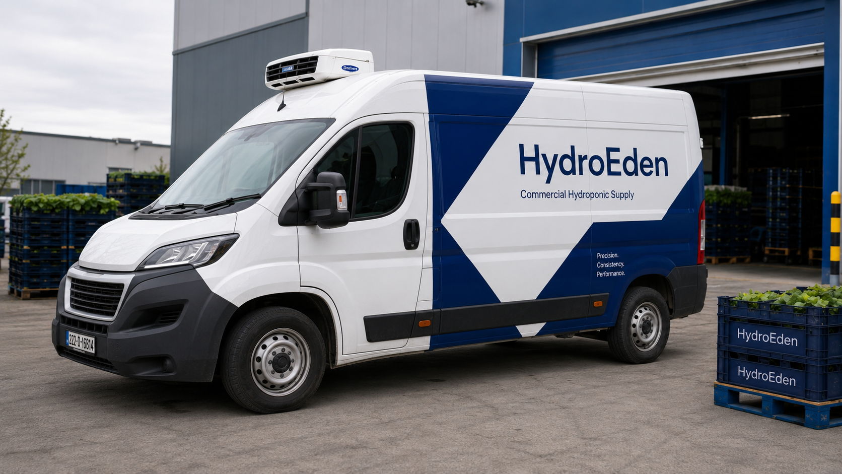
02 / Logistics surfaces
Legible at handling distance.
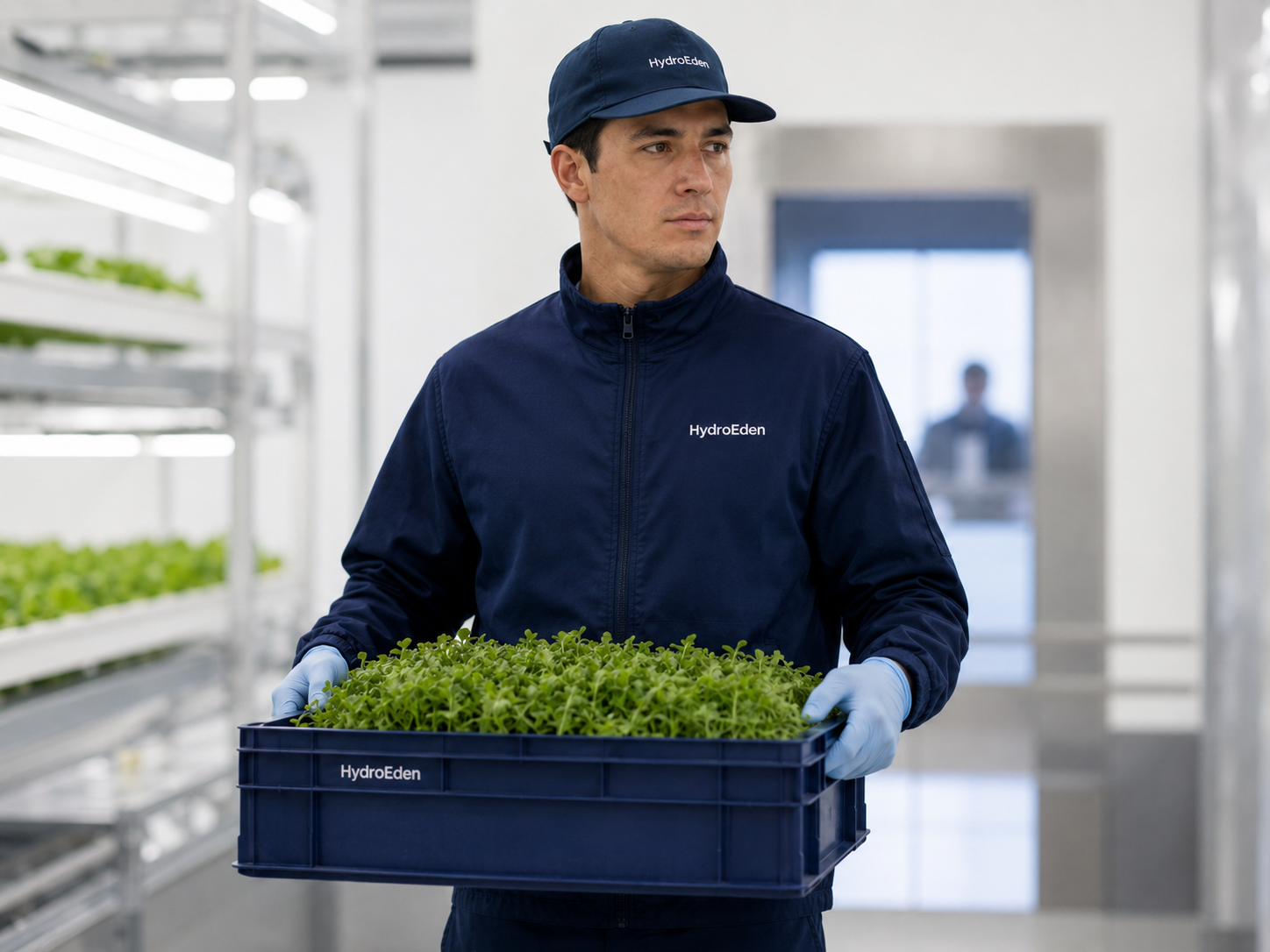
Crates and delivery vehicles are working surfaces. The mark had to stay readable in bad lighting, at a distance, and during handling.
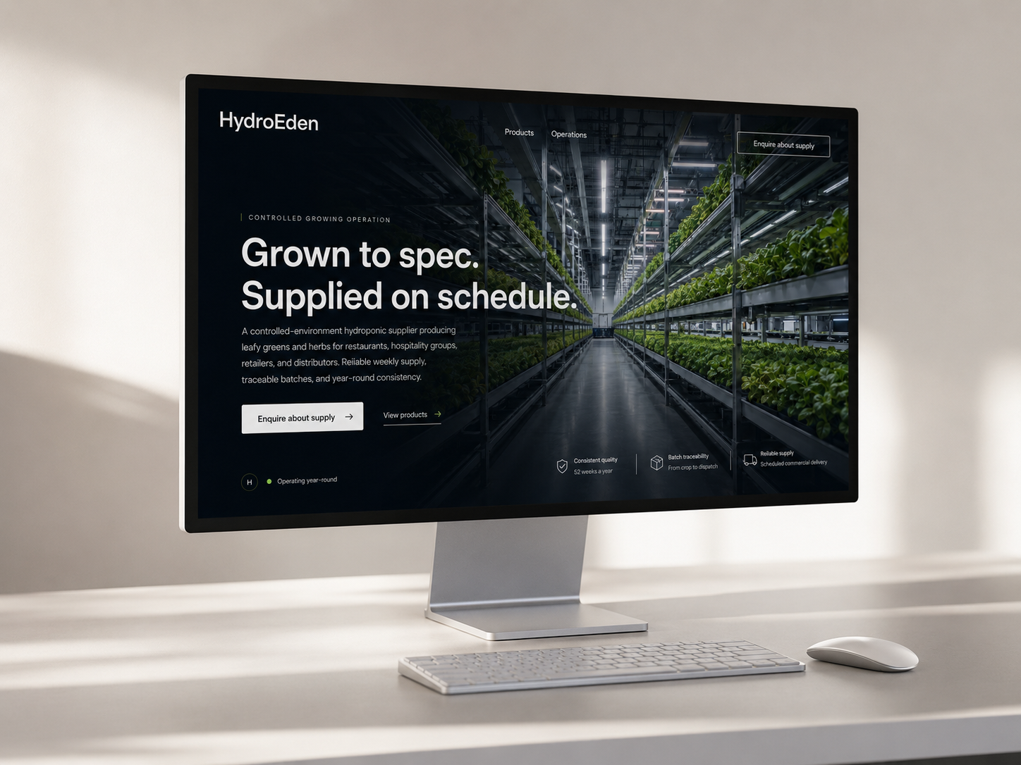
03 / Digital application
The identity translated to screen without losing its weight.
A website mockup built from the same system: dark field, structured type, the mark used as an anchor rather than decoration.
Detail study
The full set. Then each surface inspected.
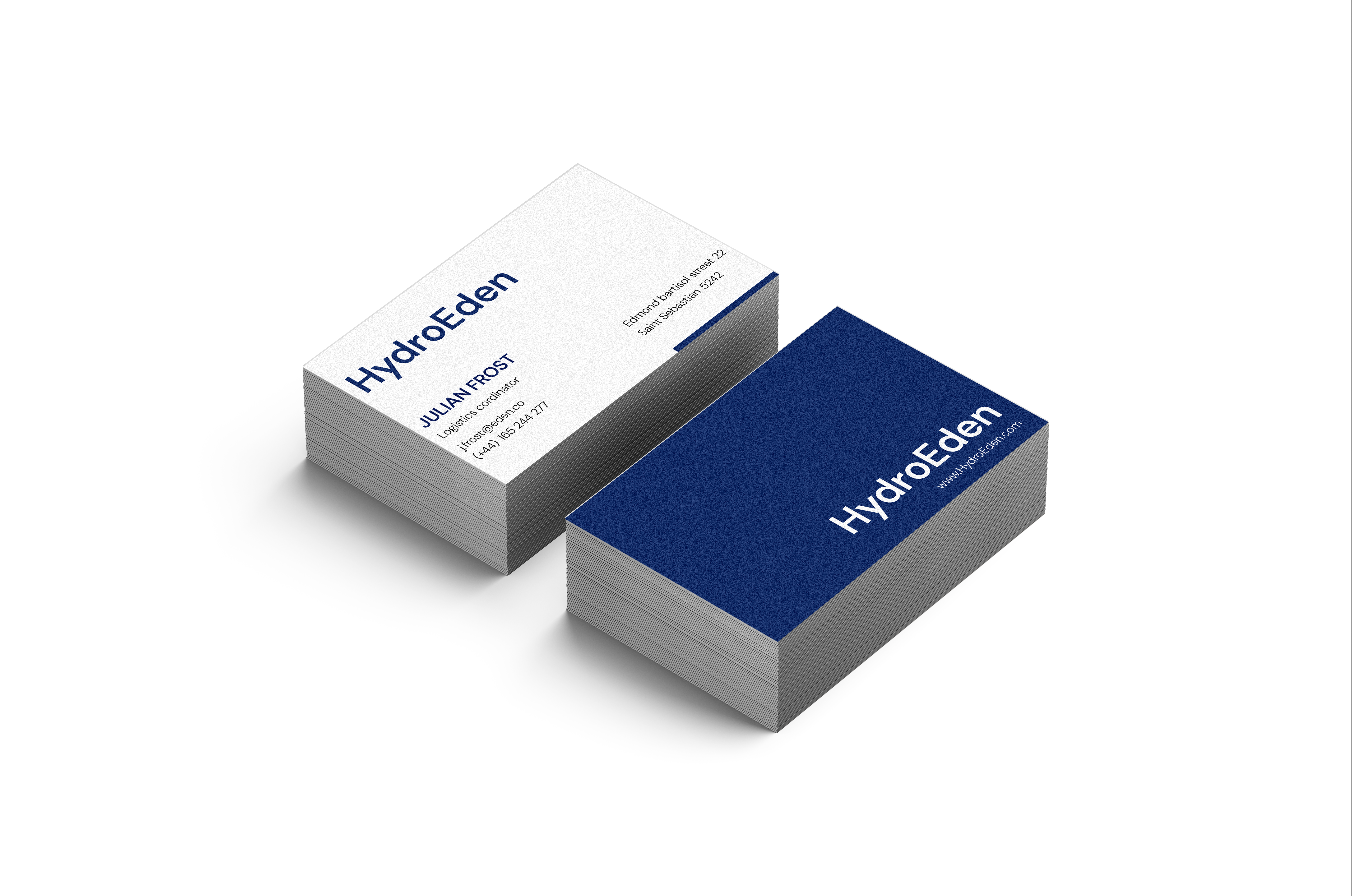

The wordmark holds at close range. Calm and precise, even at small size.
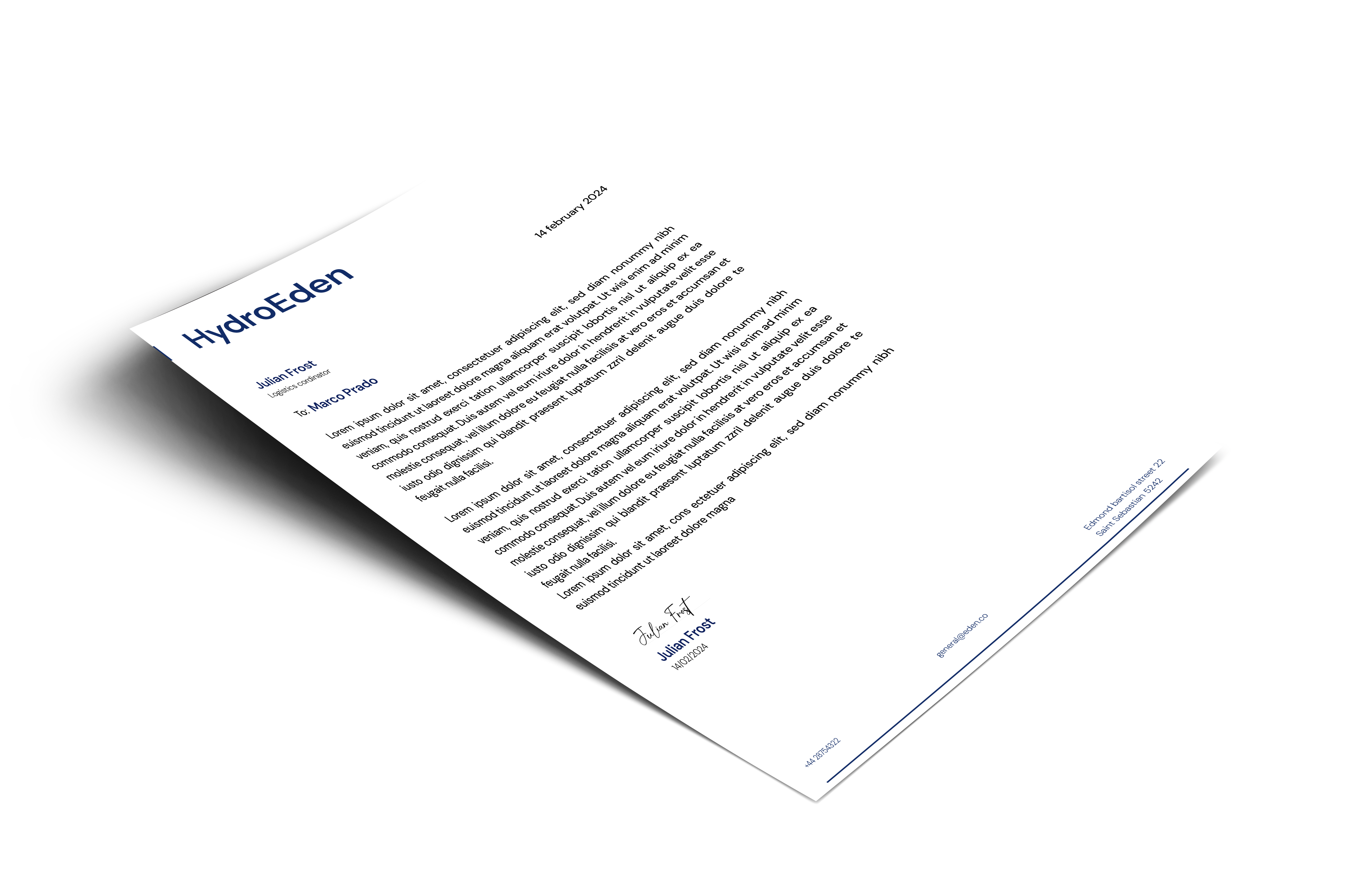
The letterhead shows whether the identity can carry operational information with restraint. Clear hierarchy. Nothing decorative.
The identity has to survive motion and handling without becoming loud. This application is the hardest test.
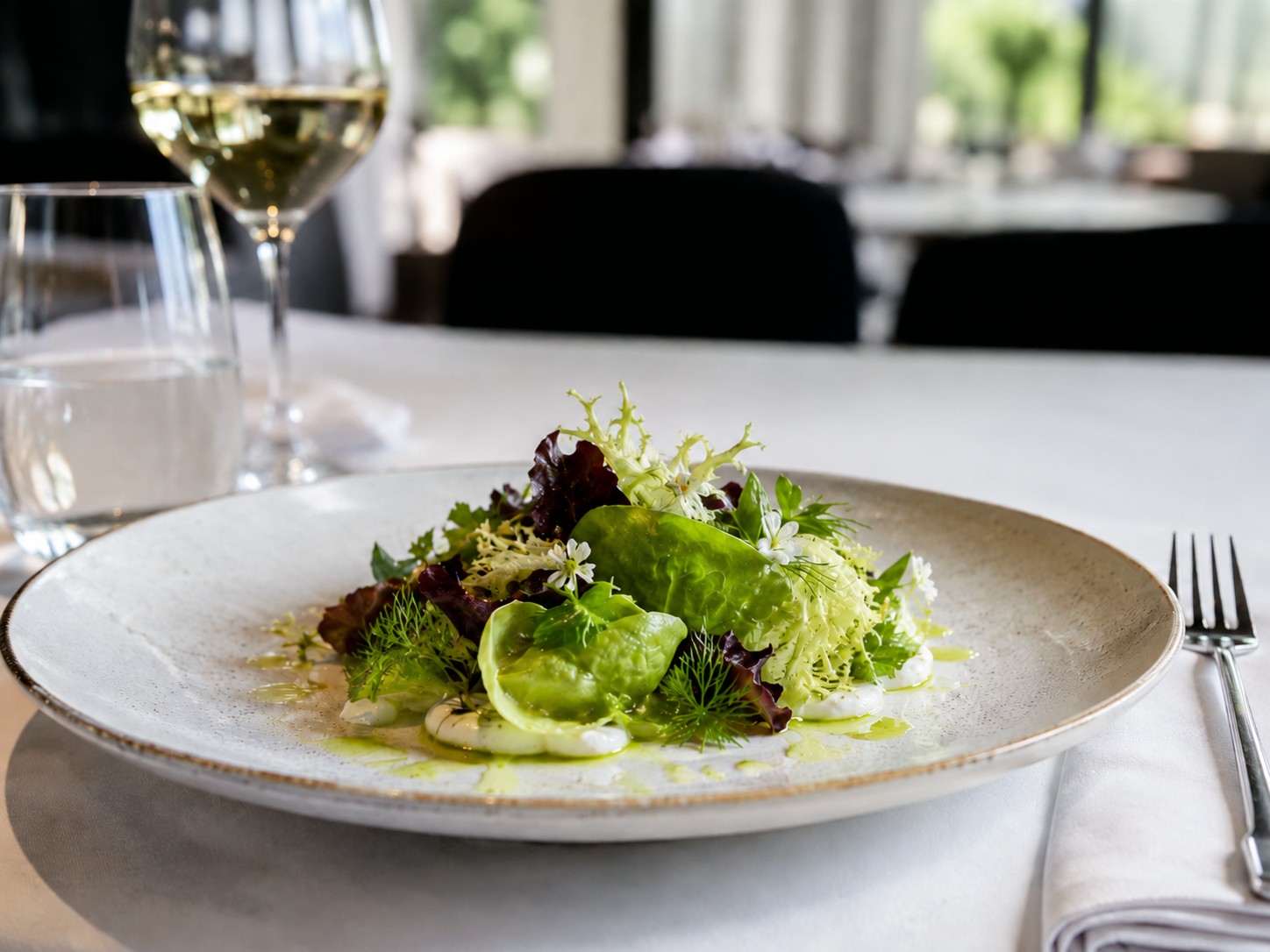
The brand reaches the end buyer here. It should read as consistent, not decorative.
The system closes at the point of use. The mark is still there — quiet, doing its job.
Identity in context
The mark has to work where it actually gets used.
04
Outcome
An identity system built from one disciplined mark.
I started with a brief about commercial trust. The result holds across six surfaces without modification. That is the test.
HydroEden — brand identity