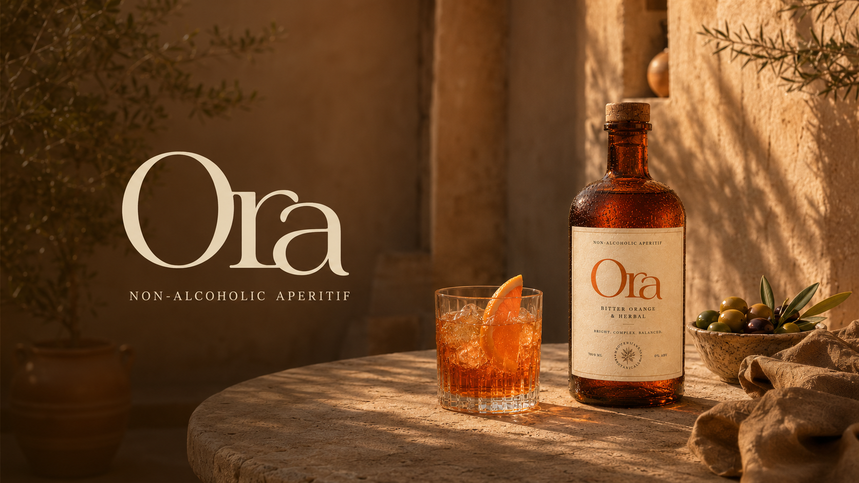
Non-alcoholic aperitif
Ora
01 / Premise
Not a substitute.
A ritual.
Ora makes alcohol-free feel social, adult, and worth preparing for.
02 / Challenge
Alcohol-free,
without apology.
The identity moves away from wellness codes and mocktail clichés. It treats the drink as an occasion.
Ora avoids
- Wellness branding
- Mocktail clichés
- Medical zero-alcohol cues
- Generic luxury tropes
Ora invites
- Ritual-led drinking
- Mediterranean warmth
- Editorial restraint
- Quiet confidence
03 / Brand Idea
Ritual without
compromise.
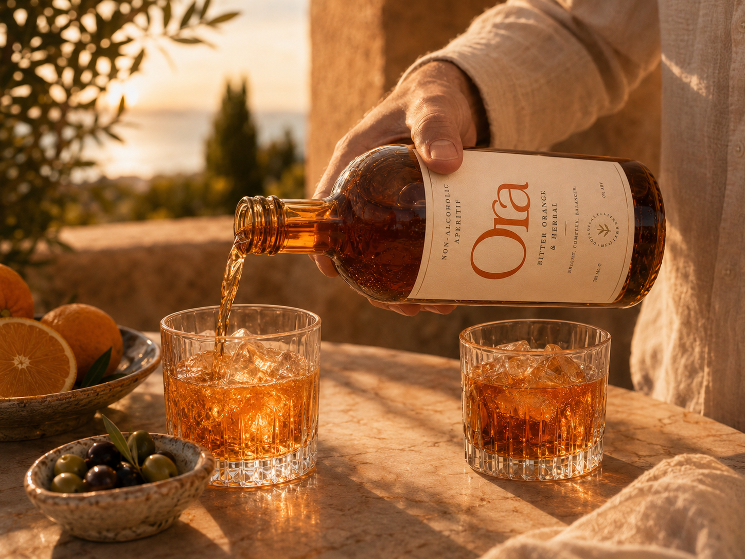
The glass, the citrus, the table, the light, the conversation.
04 / Logo exploration
Seven directions
before the answer.
The brief called for something warm and Mediterranean — but not expected. Most aperitif brands default to script or italics. The exploration tested whether Ora could be more considered.
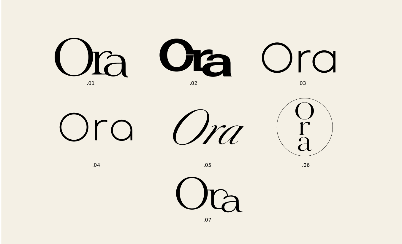
Script and italic routes were tested first and rejected immediately. They read as wine labels, not as a brand with editorial confidence.
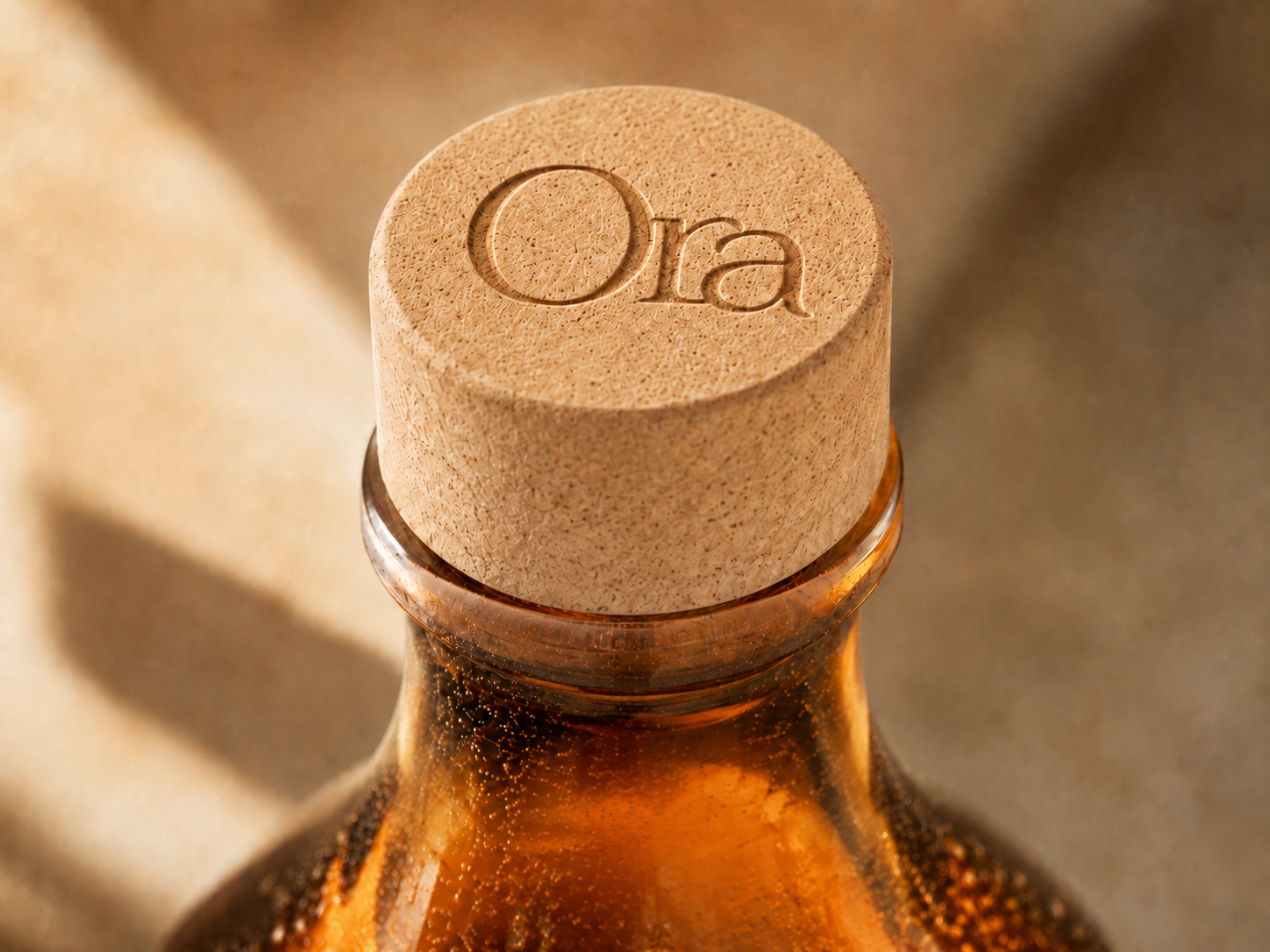
The chosen direction uses a high-contrast serif with a large capital O and smaller lowercase ra. The size contrast creates presence without needing weight or decoration.
The mark had to hold at very small scale — cork, label, gift box — without losing its warmth.
05 / Mark construction
The details that
make it distinct.
Most serif wordmarks borrow from the same defaults. Three decisions made this one specific.
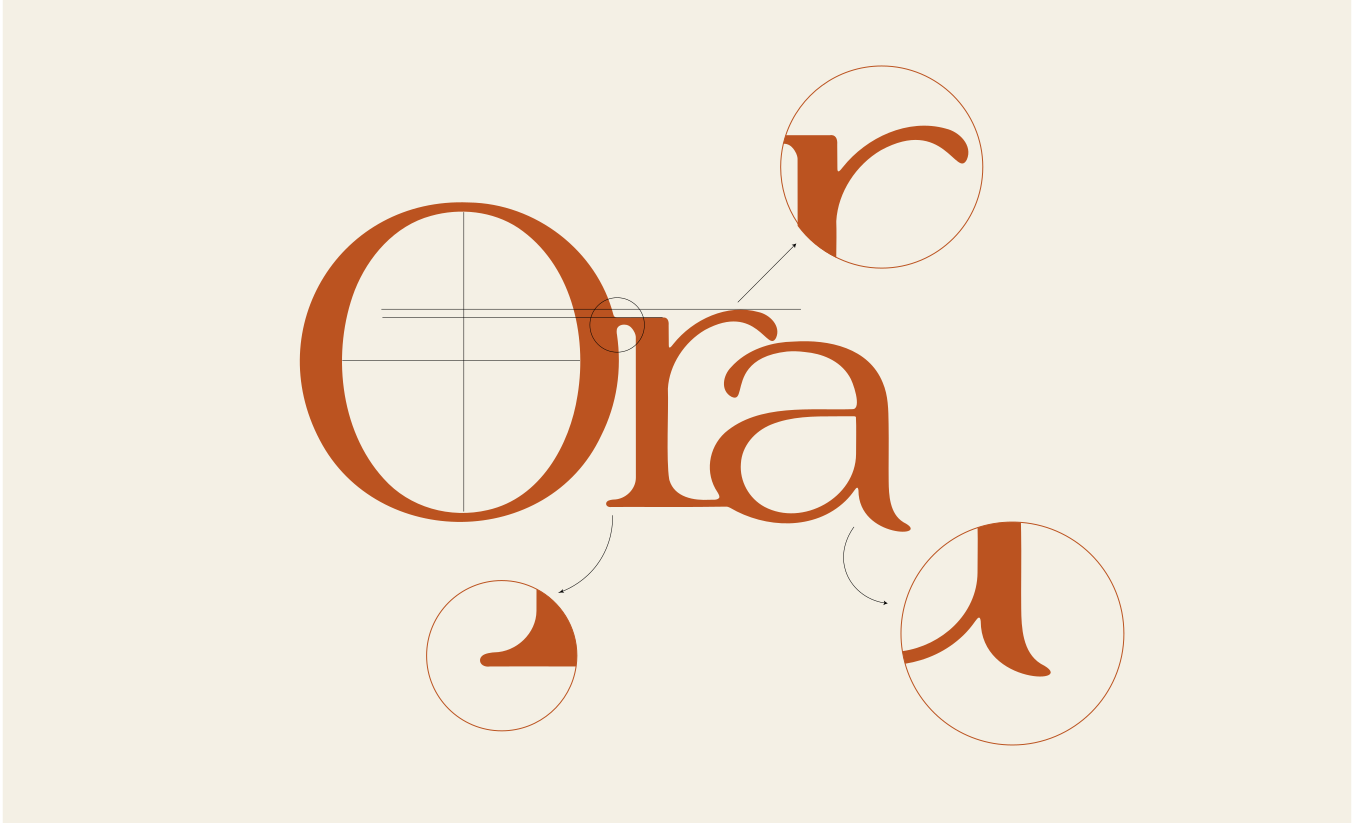
The r carries a sharp, hooked terminal. It references calligraphy without feeling decorative.
The O is built on a precise optical grid. The crosshair guides the relationship between the capital and the baseline — the size contrast between O and ra is a deliberate choice.
The a descends below the baseline with a curved tail that mirrors the terminal of the r. The two lowercase letters read as a pair.
06 / Visual System
Mediterranean warmth.
Editorial restraint.
Burnt orange, terracotta, aged olive, charcoal, and warm linen. A palette drawn from amber glass, dried botanicals, and late afternoon shadows.
07 / Brand World
Sun, stone,
citrus, shadow.
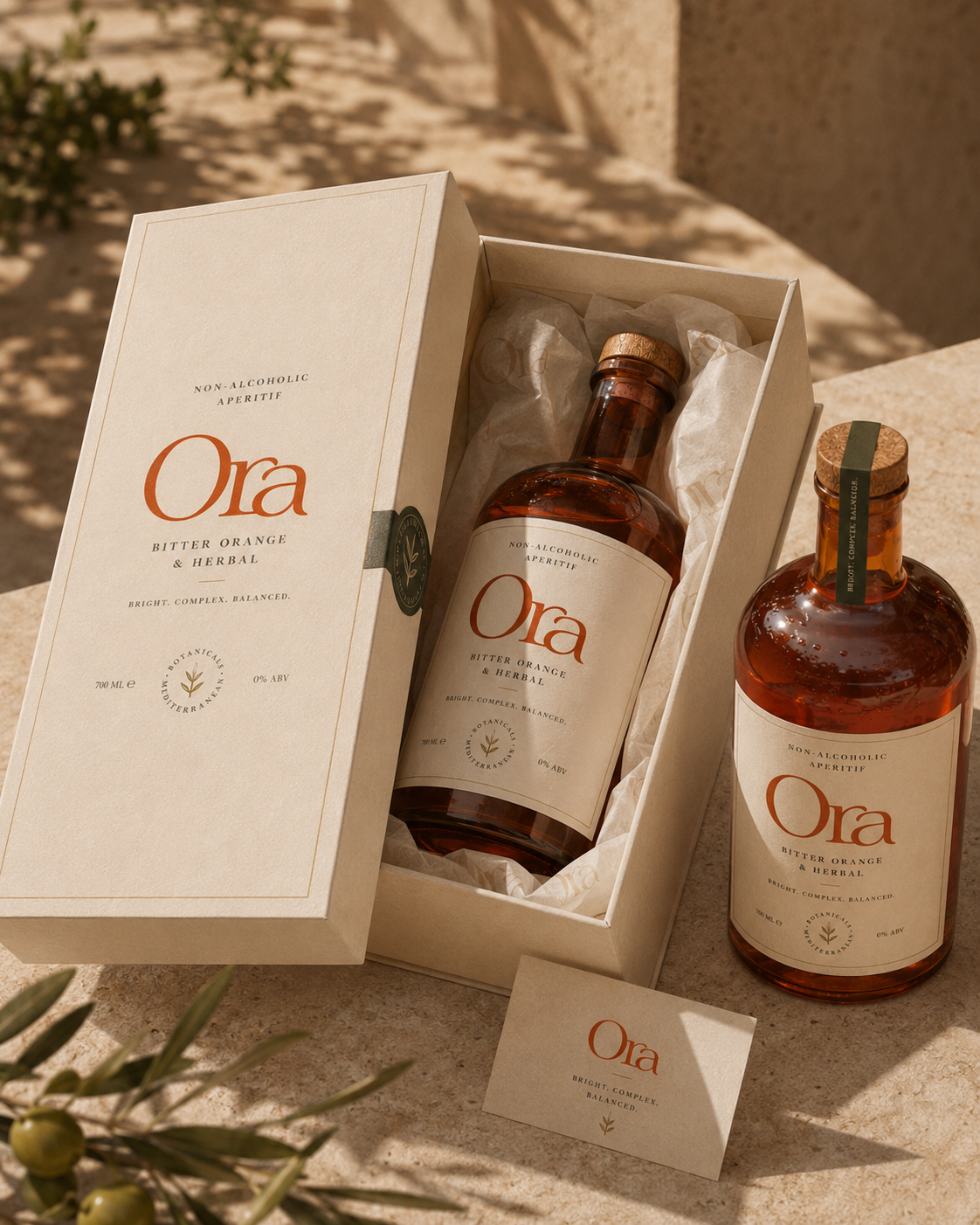
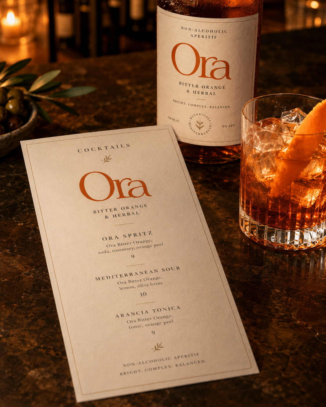
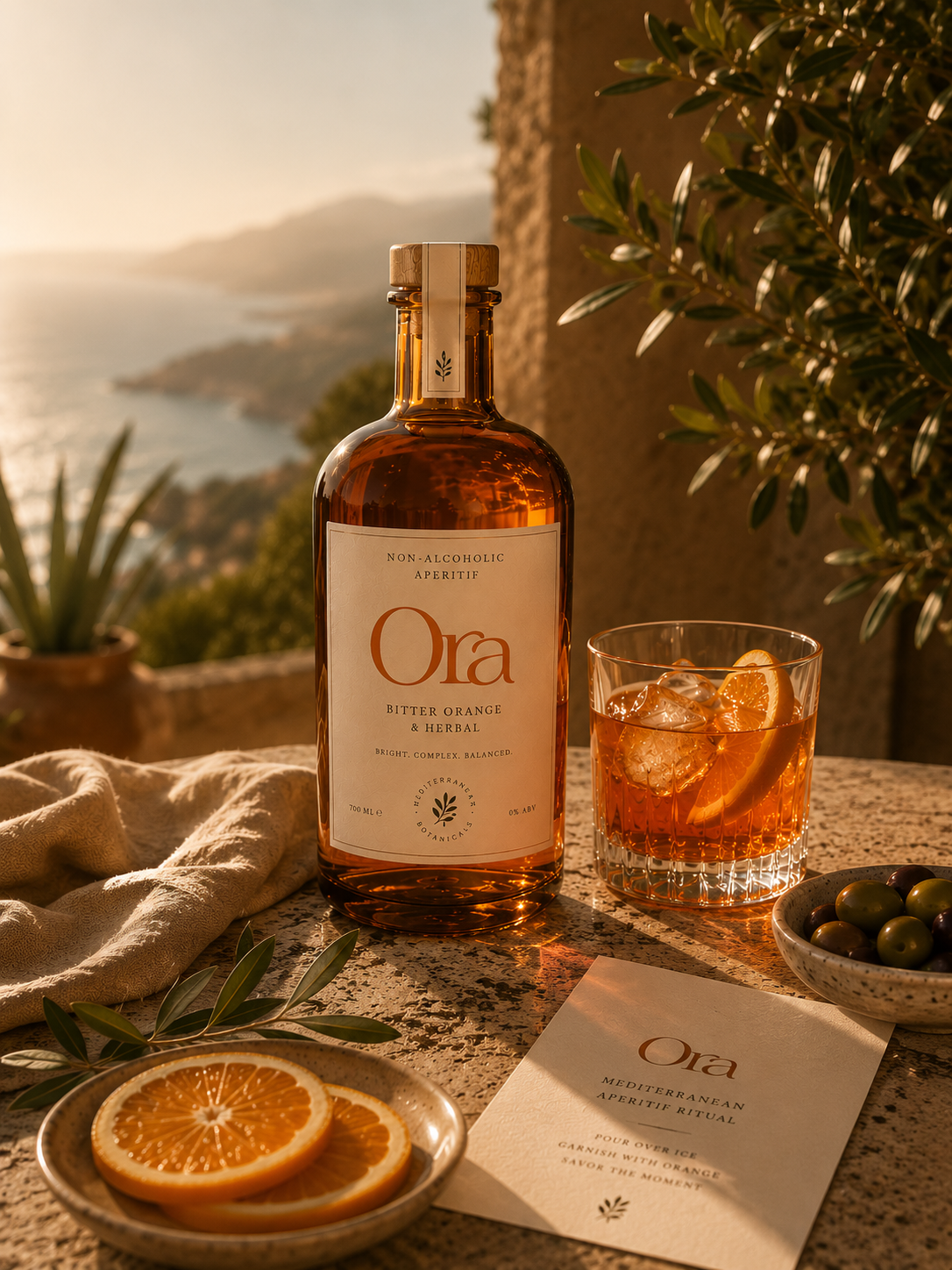
The art direction is built from natural surfaces, amber glass, condensation, and negative space.
08 / Packaging
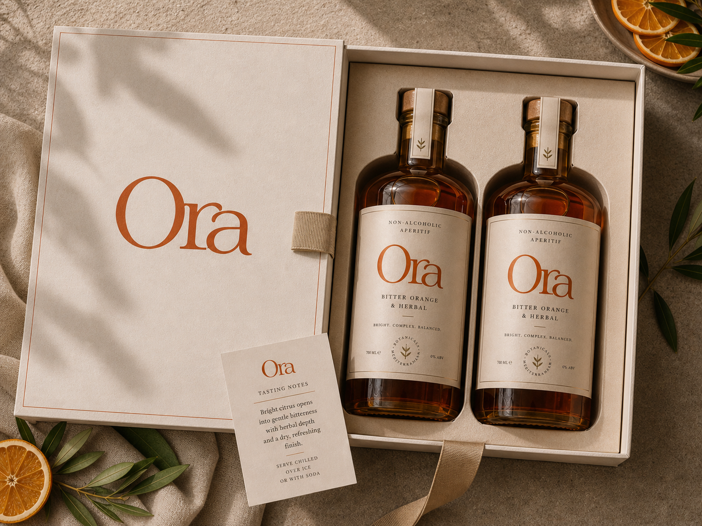
Premium through restraint.
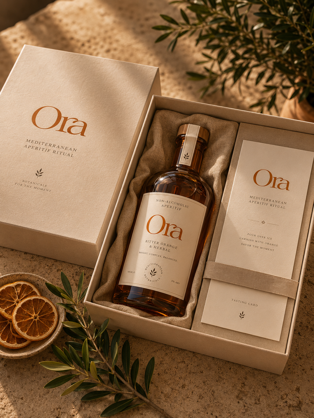
The bottle avoids loud beverage codes. Space and hierarchy do the work instead.
09 / Closing
Alcohol-free becomes
the occasion.
Designed as a ritual.
The full system — wordmark, colour, typography, art direction, and packaging — built from one premise and kept consistent across every surface.